
SwiftUI精讲:Tabs 标签页组件的实现
大家好,我们又见面了~今天给大家带来 Tabs标签页组件在SwiftUI中的实现方式。在本文中,我依然会采用一种循序渐进的方式来进行讲解,这其实也是我的实现思路,希望能帮到需要的朋友。
在看本文之前,我强烈建议你先阅读我的上一篇文章 SwiftUI精讲:自定义 Tabbar 组件 (包含过渡效果),因为有一些重复的知识点在上篇中已经讲过了,本文再讲的话难免会有些乏味,我希望每次写下的文章都有一些新的知识点~
1.Tabs组件的实现
我们先创建 Componets 文件夹,并在其中创建 tabs 文件,我们先简单地创建一个list,并将内容遍历渲染出来,如下所示:
1-1:大致UI的实现
import SwiftUI

struct TabItem: Identifiable {
    var id:Int
    var text:String
}

struct tabs: View {
    let list:[TabItem]
    @State var currentSelect:Int = 0
    var body: some View {
        ScrollView(.horizontal,showsIndicators: false) {
            HStack {
                ForEach(list) { tabItem in
                    Button{
                        currentSelect = tabItem.id
                    } label: {
                        HStack{
                            Spacer()
                            Text(tabItem.text)
                                .padding(.horizontal,12)
                                .fixedSize()
                            Spacer()
                        }
                    }
                }
            }
            .frame(minWidth: UIScreen.main.bounds.width)
        }
    }
}

struct tabs_Previews: PreviewProvider {
    // 创建一些测试数据
    static let list = [
        TabItem(id:1,text:"关注"),
        TabItem(id:2,text:"推荐"),
        TabItem(id:3,text:"热榜"),
        TabItem(id:4,text:"头条精选"),
        TabItem(id:5,text:"后端"),
        TabItem(id:6,text:"前端")
    ]
    static var previews: some View {
        tabs(list: list)
    }
}
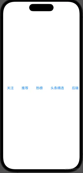
这里加上 .frame(minWidth: UIScreen.main.bounds.width) 是为了保证在标签只有两三个的时候,我依然希望它们处于一个均匀布局的状态。代码运行后如图所示:
接着我们加上下划线样式,代码如下所示:
import SwiftUI

struct TabItem: Identifiable {
    var id:Int
    var text:String
}


struct tabs: View {
    let list:[TabItem]
    @State var currentSelect:Int = 1
    var body: some View {
        ScrollView(.horizontal,showsIndicators: false) {
            HStack {
                ForEach(list) { tabItem in
                    Button{
                        currentSelect = tabItem.id
                    } label: {
                        HStack{
                            Spacer()
                            Text(tabItem.text)
                                .padding(EdgeInsets(top: 8, leading: 12, bottom: 10, trailing: 12))
                                .fixedSize()
                            Spacer()
                        }
                        .background(
                            VStack{
                                if(currentSelect == tabItem.id){
                                    Spacer()
                                    Rectangle()
                                        .fill(Color(hex: "#1677ff"))
                                        .frame(height: 2)
                                        .padding(.horizontal,12)
                                        .cornerRadius(2)
                                }
                            }

                        )

                    }
                }
            }
            .frame(minWidth: UIScreen.main.bounds.width)
        }
    }
}

struct tabs_Previews: PreviewProvider {
    // 创建一些测试数据
    static let list = [
        TabItem(id:1,text:"关注"),
        TabItem(id:2,text:"推荐"),
        TabItem(id:3,text:"热榜"),
        TabItem(id:4,text:"头条精选"),
        TabItem(id:5,text:"后端"),
        TabItem(id:6,text:"前端")
    ]
    static var previews: some View {
        tabs(list: list)
    }
}
细心的朋友可能会发现,我的代码里面出现了 Color(hex: "#1677ff"),这是因为我们对Color结构进行了拓展,让它支持16进制颜色的传递,如下所示:
extension Color {
    init(hex: String) {
        let hex = hex.trimmingCharacters(in: CharacterSet.alphanumerics.inverted)
        var int: UInt64 = 0
        Scanner(string: hex).scanHexInt64(&int)
        let a, r, g, b: UInt64
        switch hex.count {
        case 3: // RGB (12-bit)
            (a, r, g, b) = (255, (int >> 8) * 17, (int >> 4 & 0xF) * 17, (int & 0xF) * 17)
        case 6: // RGB (24-bit)
            (a, r, g, b) = (255, int >> 16, int >> 8 & 0xFF, int & 0xFF)
        case 8: // ARGB (32-bit)
            (a, r, g, b) = (int >> 24, int >> 16 & 0xFF, int >> 8 & 0xFF, int & 0xFF)
        default:
            (a, r, g, b) = (1, 1, 1, 0)
        }

        self.init(
            .sRGB,
            red: Double(r) / 255,
            green: Double(g) / 255,
            blue:  Double(b) / 255,
            opacity: Double(a) / 255
        )
    }
}
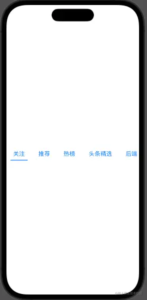
代码运行后的效果如图所示:
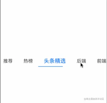
我们再对字体方面进行优化,我们希望点击后的字体颜色和大小和点击前保持不一致,我们对代码做出修改,如下所示:
HStack{
    Spacer()
    Text(tabItem.text)
        .padding(EdgeInsets(top: 8, leading: 12, bottom: 10, trailing: 12))
        .fixedSize()
        .foregroundColor(currentSelect == tabItem.id ? Color(hex: "#1677ff") : Color(hex: "#333"))
        // 新增
        .font(.system(size: currentSelect == tabItem.id ? 20 : 17))
        // 新增
        .fontWeight(currentSelect == tabItem.id ? .bold : .regular)
    Spacer()
}
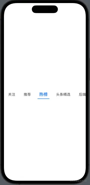
更改后的效果如图所示:
好了,我们一个普通的tab组件就写完了,完结撒花。
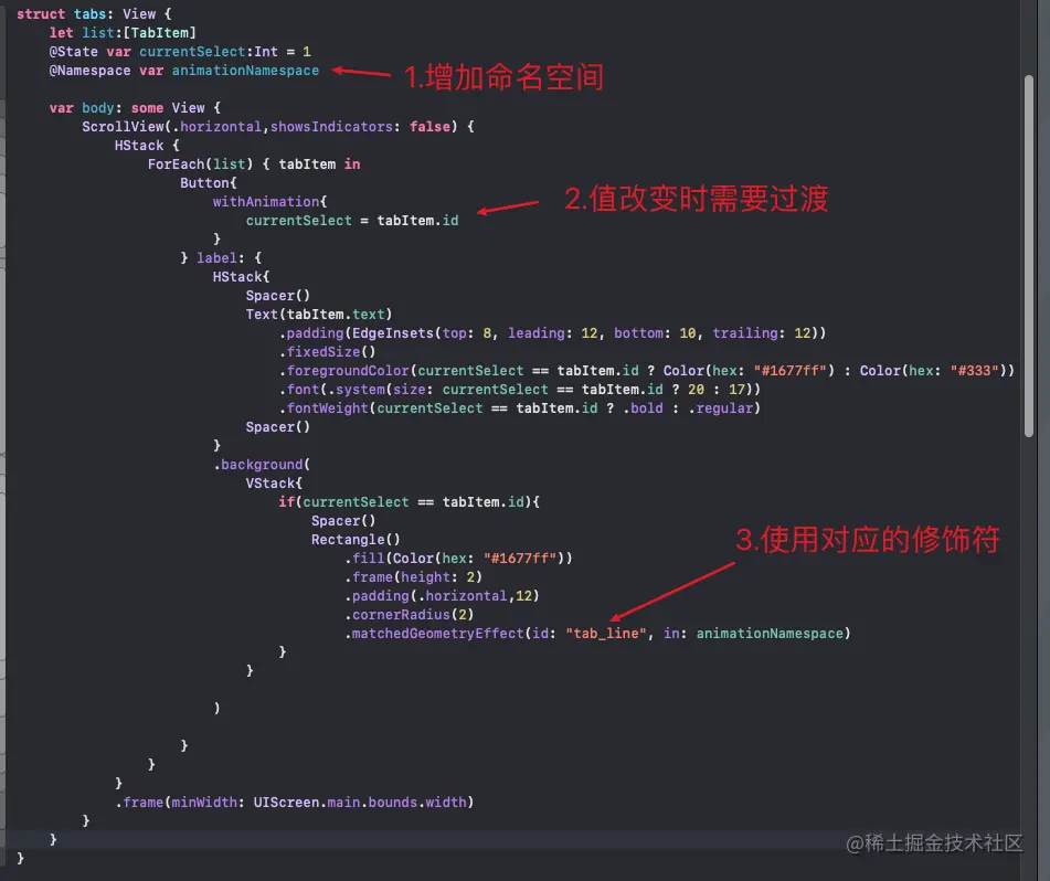
接下来我们需要给下划线添加相应的过渡效果,类似于掘金的下划线移动过渡。如果有从事web端开发的朋友们,我们可以想一下,在web端我们是怎么实现类似的效果的?是不是要通过一些计算,然后赋值给下划线 css的 left 值,或者是 translateX 值。在SwiftUI中,我们压根不用这么麻烦,我们可以使用 matchedGeometryEffect 来轻易的做到相应的效果!
1-2:下划线过渡效果实现
我们对代码稍微修改下,详细的步骤我会在图中进行标注,如下图所示:
接着我们按下 command + R ,运行 Simulator 来查看对应的效果:

可以发现,我们其实已经取得了我们想要的效果。但是由于 tab 在激活的时候,文字对应的动画看着十分晃眼,很讨人厌。如果希望只保留下划线的过渡效果,而不要文字的过渡效果,该怎么做呢?
很简单,我们只需要添加 .animation(nil,value:UUID()) 即可,如下所示:
Text(tabItem.text)
    .padding(EdgeInsets(top: 8, leading: 12, bottom: 10, trailing: 12))
    .fixedSize()
    .foregroundColor(currentSelect == tabItem.id ? Color(hex: "#1677ff") : Color(hex: "#333"))
    .font(.system(size: currentSelect == tabItem.id ? 20 : 17))
    .fontWeight(currentSelect == tabItem.id ? .bold : .regular)
    // 新增
    .animation(nil,value:UUID())
现在看起来是不是正常多了?

1-3:自动滚动到对应位置
大致UI画得差不多了,接下来我们需要在点击比较靠后的tab时,我们希望 ScrollView 能帮我们滚动到对应的位置,我们该怎么做呢?
答案是引入 ScrollViewReader, 使用 ScrollViewProxy中的scrollTo方法,代码如下所示:
struct tabs: View {
    let list:[TabItem]
    @State var currentSelect:Int = 1
    @Namespace var animationNamespace

    var body: some View {
        ScrollViewReader { scrollProxy in
            ScrollView(.horizontal,showsIndicators: false) {
                HStack {
                    ForEach(list) { tabItem in
                        Button{
                            withAnimation{
                                currentSelect = tabItem.id
                            }
                        } label: {
                            HStack{
                                Spacer()
                                Text(tabItem.text)
                                    .padding(EdgeInsets(top: 8, leading: 12, bottom: 10, trailing: 12))
                                    .fixedSize()
                                    .foregroundColor(currentSelect == tabItem.id ? Color(hex: "#1677ff") : Color(hex: "#333"))
                                    .font(.system(size: currentSelect == tabItem.id ? 20 : 17))
                                    .fontWeight(currentSelect == tabItem.id ? .bold : .regular)
                                    .animation(nil,value:UUID())

                                Spacer()
                            }
                            .background(
                                VStack{
                                    if(currentSelect == tabItem.id){
                                        Spacer()
                                        Rectangle()
                                            .fill(Color(hex: "#1677ff"))
                                            .frame(height: 2)
                                            .padding(.horizontal,12)
                                            .cornerRadius(2)
                                            .matchedGeometryEffect(id: "tab_line", in: animationNamespace)
                                    }
                                }

                            )

                        }
                    }
                }
                .frame(minWidth: UIScreen.main.bounds.width)
            }
            .onChange(of: currentSelect) { newSelect in
                withAnimation(.easeInOut) {
                    scrollProxy.scrollTo(currentSelect,anchor: .center)
               }
            }
        }
    }
}
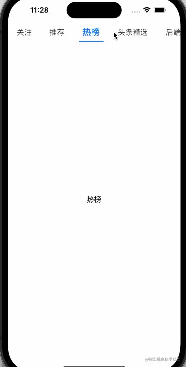
在代码中,我们利用 scrollProxy.scrollTo 方法,轻易地实现了滚动到对应tab的位置。效果如下所示:
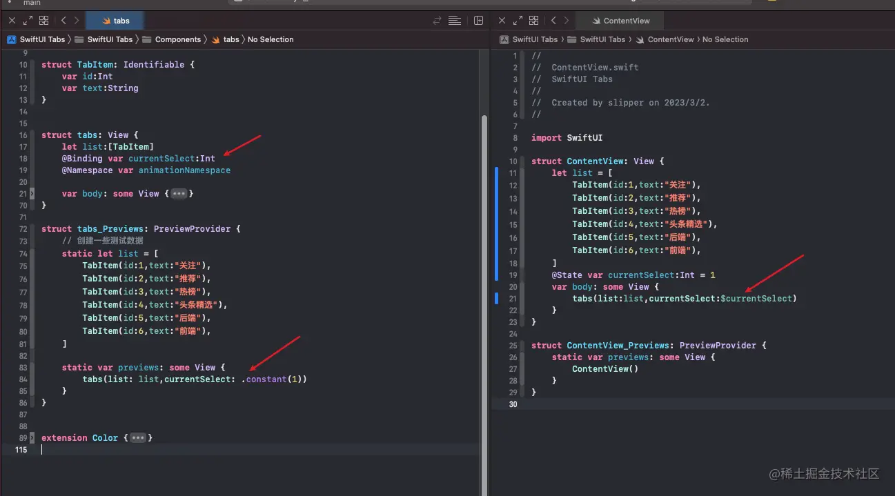
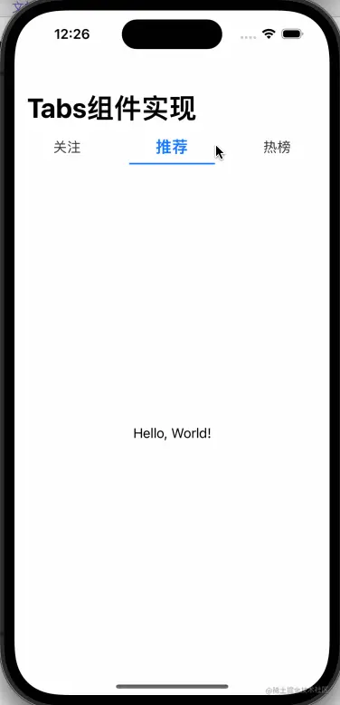
呜呼,目前为止,我们已经完成了一个不错的tabs组件。接下来在ContentView中,我们引入该组件。由于我们需要在父视图中知道tabs中currentSelect的变化,我们需要把子组件的 @State 改成 @Binding,同时为了避免 preview报错,我们也要做出对应的修改,如图所示:
1-4:结合TabView完成手势滑动切换
日常我们在使用tabs标签页的时候,如果需要支持用户通过手势进行切换标签页的操作,我们可以结合TabView一起使用,代码如下所示:
import SwiftUI

struct ContentView: View {
    let list = [
        TabItem(id:1,text:"关注"),
        TabItem(id:2,text:"推荐"),
        TabItem(id:3,text:"热榜"),
        TabItem(id:4,text:"头条精选"),
        TabItem(id:5,text:"后端"),
        TabItem(id:6,text:"前端"),
    ]


    @State var currentSelect:Int = 1
    var body: some View {
        VStack(spacing: 0){
            tabs(list:list,currentSelect:$currentSelect)
            TabView(selection:$currentSelect){
                ForEach(list){tabItem in
                    Text(tabItem.text).tag(tabItem.id)
                }
            }.tabViewStyle(.page(indexDisplayMode: .never))
        }
    }
}

struct ContentView_Previews: PreviewProvider {
    static var previews: some View {
        ContentView()
    }
}
效果如下所示:
至此,我们总算是完成了一个能满足大部分需求的Tabs组件啦~
2. Tabs组件的拓展
2-1:Tabs组件的吸顶
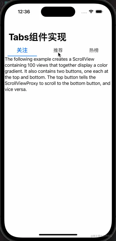
仅仅实现一个简单的效果怎么够,这不符合笔者精讲技术的精神,我们还要结合日常的业务进行思考。比如,我现在想要在页面滚动的时候,我希望tabs组件能够自动吸顶,应该怎么去实现呢?
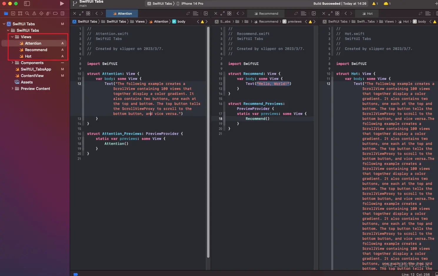
首先我们新建View文件夹,在其中放置一些视图组件,并在组件中,添加一些文本,如图所示:
接着我们先思考一下,如何在SwiftUI中做出一个吸顶的效果。这里我使用了 LazyVStack + Section的方式来做。但是有个问题,TabView被包裹在Section里面时,TabView的高度会丢失。我将会在 ScrollView 的外层套上 GeometryReader 来解决这个问题,以下为代码展示:
import SwiftUI

struct ContentView: View {
    let list = [
        TabItem(id:1,text:"关注"),
        TabItem(id:2,text:"推荐"),
        TabItem(id:3,text:"热榜")
    ]

    @State var currentSelect:Int = 1
    var body: some View {
        NavigationView{
            GeometryReader { proxy in
                ScrollView{
                    LazyVStack(spacing: 0, pinnedViews:.sectionHeaders) {
                        Section(
                            header:tabs(list:list,currentSelect:$currentSelect)
                                .background(.white)
                        ){
                            TabView(selection:$currentSelect){
                                ForEach(list){tabItem in
                                    VStack{
                                        switch currentSelect{
                                        case 1:
                                            Attention()
                                        case 2:
                                            Recommend()
                                        case 3:
                                            Hot()
                                        default:
                                            Text("")
                                        }
                                    }
                                    .tag(tabItem.id)
                                }
                            }
                            .tabViewStyle(.page(indexDisplayMode: .never))
                            .frame(minHeight:proxy.size.height)
                        }
                    }
                }
            }
            .navigationTitle("Tabs组件实现")
        }
    }
}

struct ContentView_Previews: PreviewProvider {
    static var previews: some View {
        ContentView()
    }
}
效果如图所示:
2-2:下拉刷新的实现
要实现下拉刷新的功能,我们可以使用ScrollView并结合.refreshable 来实现这个效果,代码如下所示:
import SwiftUI

struct ContentView: View {
    let list = [
        TabItem(id:1,text:"关注"),
        TabItem(id:2,text:"推荐"),
        TabItem(id:3,text:"热榜")
    ]

    @State var currentSelect:Int = 1
    var body: some View {
        NavigationView{
            GeometryReader { proxy in
                ScrollView{
                    LazyVStack(spacing: 0, pinnedViews:.sectionHeaders) {
                        Section(
                            header:tabs(list:list,currentSelect:$currentSelect)
                                .background(.white)
                        ){
                            TabView(selection:$currentSelect){
                                ForEach(list){tabItem in
                                    ScrollView{
                                        switch currentSelect{
                                        case 1:
                                            Attention()
                                        case 2:
                                            Recommend()
                                        case 3:
                                            Hot()
                                        default:
                                            Text("")
                                        }
                                    }
                                    .tag(tabItem.id)
                                    .refreshable {
                                        print("触发刷新")
                                    }
                                }
                            }
                            .tabViewStyle(.page(indexDisplayMode: .never))
                            .frame(minHeight:proxy.size.height)
                        }
                    }
                }
            }
            .navigationTitle("Tabs组件实现")
        }
    }
}

struct ContentView_Previews: PreviewProvider {
    static var previews: some View {
        ContentView()
    }
}
在这里要注意 .refreshable 是 ios15 才能使用的,使用时要考虑API的兼容性。效果如图所示:
至此,我们已经完成了一个很不错的Tabs标签页组件啦。感谢你的阅读,如有问题欢迎在评论区中进行交流~
链接:https://juejin.cn/post/7208016902039207993
来源:稀土掘金
著作权归作者所有。商业转载请联系作者获得授权,非商业转载请注明出处。
