
Vue实现一个“液态玻璃”效果登录卡片
Vue实现一个“液态玻璃”效果登录卡片
效果介绍
液态玻璃(Liquid Glass)是一种极具现代感的UI视觉风格,常见于高端网站和操作系统界面。它通过多层叠加、模糊、光泽、滤镜等技术,模拟出玻璃的通透、折射和高光质感。苹果的这次系统设计更新,带火了这一设计效果,本教程将带你一步步实现一个带有3D灵动倾斜交互的液态玻璃登录卡片。
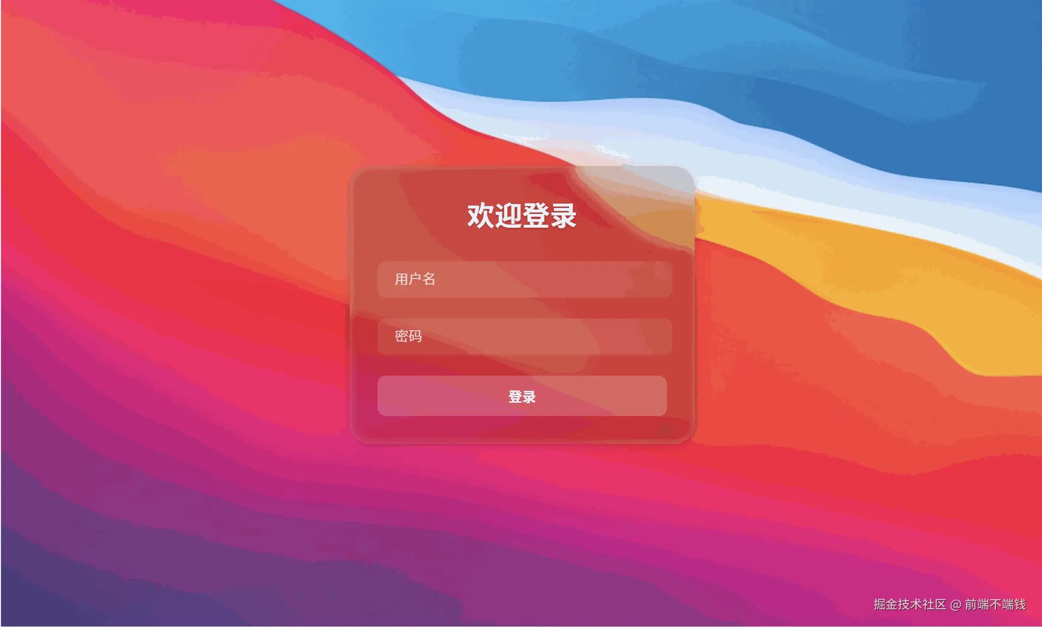
实际效果:
技术原理解析
1. 多层叠加
液态玻璃效果的核心是多层视觉叠加:
- 模糊层(blur):让背景内容变得虚化,产生玻璃的通透感。
- 色调层(tint):为玻璃加上一层淡淡的色彩,提升质感。
- 高光层(shine):模拟玻璃边缘的高光和内阴影,增强立体感。
- SVG滤镜:通过 SVG 的
feTurbulence和feDisplacementMap,让玻璃表面产生微妙的扭曲和流动感。
2. 3D灵动倾斜
通过监听鼠标在卡片上的移动,动态计算并设置 transform: perspective(...) rotateX(...) rotateY(...),让卡片随鼠标灵动倾斜,增强交互体验。
3. 背景与环境
背景可以是渐变色,也可以是图片。玻璃卡片通过 backdrop-filter 与背景内容产生交互,形成真实的玻璃质感。
实现步骤详解
1. 结构搭建
<template>

  <div class="login-container animated-background">

    <!-- SVG滤镜库 -->

    <svg style="display: none">...</svg>

    <!-- 登录卡片 -->

    <div

      class="glass-component login-card"

      ref="tiltCard"

      @mousemove="handleMouseMove"

      @mouseleave="handleMouseLeave"

    >

      <div class="glass-effect"></div>

      <div class="glass-tint"></div>

      <div class="glass-shine"></div>

      <div class="glass-content">

        <!-- 登录表单内容 -->

      </div>

    </div>

  </div>

</template>
2. SVG滤镜实现液态扭曲
<svg style="display: none">
<filter id="glass-distortion" x="0%" y="0%" width="100%" height="100%" filterUnits="objectBoundingBox">
<feTurbulence type="fractalNoise" baseFrequency="0.001 0.005" numOctaves="1" seed="17" result="turbulence" />
<feComponentTransfer in="turbulence" result="mapped">
<feFuncR type="gamma" amplitude="1" exponent="10" offset="0.5" />
<feFuncG type="gamma" amplitude="0" exponent="1" offset="0" />
<feFuncB type="gamma" amplitude="0" exponent="1" offset="0.5" />
</feComponentTransfer>
<feGaussianBlur in="turbulence" stdDeviation="3" result="softMap" />
<feSpecularLighting in="softMap" surfaceScale="5" specularConstant="1" specularExponent="100" lighting-color="white" result="specLight">
<fePointLight x="-200" y="-200" z="300" />
</feSpecularLighting>
<feComposite in="specLight" operator="arithmetic" k1="0" k2="1" k3="1" k4="0" result="litImage" />
<feDisplacementMap in="SourceGraphic" in2="softMap" scale="200" xChannelSelector="R" yChannelSelector="G" />
</filter>
</svg>
- 这段 SVG 代码必须放在页面结构内,供 CSS filter 调用。
3. 背景设置
.animated-background {
width: 100vw;
height: 100vh;
background-image: url('你的背景图片路径');
background-size: cover;
background-position: center;
background-repeat: no-repeat;
position: fixed;
top: 0;
left: 0;
z-index: -1;

}
- 建议用高质量渐变或壁纸,能更好衬托玻璃质感。
4. 卡片多层玻璃结构
.login-card {
width: 400px;
border-radius: 24px;
overflow: hidden;
box-shadow: 0 4px 24px 0 rgba(0,0,0,0.10), 0 1.5px 6px 0 rgba(0,0,0,0.08);
background: transparent;
position: relative;

}
.glass-effect {
position: absolute;

  inset: 0;
z-index: 0;

  backdrop-filter: blur(5px);
filter: url(#glass-distortion);
isolation: isolate;
border-radius: 24px;

}
.glass-tint {
position: absolute;

  inset: 0;
z-index: 1;
background: rgba(0, 0, 0, 0.15);
border-radius: 24px;

}
.glass-shine {
position: absolute;

  inset: 0;
z-index: 2;
border: 1px solid rgba(255, 255, 255, 0.13);
border-radius: 24px;
box-shadow:

    inset 1px 1px 8px 0 rgba(255, 255, 255, 0.18),

    inset -1px -1px 8px 0 rgba(255, 255, 255, 0.08);
pointer-events: none;

}
.glass-content {
position: relative;
z-index: 3;
padding: 2rem;
color: white;

}
- 每一层都要有一致的 border-radius,才能保证圆角处无割裂。
5. 3D灵动倾斜交互
methods: {

  handleMouseMove (e) {
const card = this.$refs.tiltCard
const rect = card.getBoundingClientRect()
const x = e.clientX - rect.left
const y = e.clientY - rect.top
const centerX = rect.width / 2
const centerY = rect.height / 2
const maxTilt = 18
const rotateY = ((x - centerX) / centerX) * maxTilt
const rotateX = -((y - centerY) / centerY) * maxTilt

    card.style.transform = `perspective(600px) rotateX(${rotateX}deg) rotateY(${rotateY}deg) scale(1.03)`

  },

  handleMouseLeave () {
const card = this.$refs.tiltCard

    card.style.transform = 'perspective(600px) rotateX(0deg) rotateY(0deg) scale(1)'

  }

}
- 鼠标移动时,卡片会根据指针位置灵动倾斜。
- 鼠标移出时,卡片平滑恢复。
6. 细节优化
- 阴影柔和:避免黑色边缘过重,提升高级感。
- 高光线条:用低透明度白色边框和内阴影,模拟玻璃高光。
- 所有层的圆角一致:防止割裂。
- 表单输入框:用半透明背景和模糊,保持整体风格统一。
7.完整代码
<template>

  <div class="login-container animated-background">

    <!-- SVG滤镜库 -->

    <svg style="display: none">

      <filter id="glass-distortion" x="0%" y="0%" width="100%" height="100%" filterUnits="objectBoundingBox">

        <feTurbulence type="fractalNoise" baseFrequency="0.001 0.005" numOctaves="1" seed="17" result="turbulence" />

        <feComponentTransfer in="turbulence" result="mapped">

          <feFuncR type="gamma" amplitude="1" exponent="10" offset="0.5" />

          <feFuncG type="gamma" amplitude="0" exponent="1" offset="0" />

          <feFuncB type="gamma" amplitude="0" exponent="1" offset="0.5" />

        </feComponentTransfer>

        <feGaussianBlur in="turbulence" stdDeviation="3" result="softMap" />

        <feSpecularLighting in="softMap" surfaceScale="5" specularConstant="1" specularExponent="100" lighting-color="white" result="specLight">

          <fePointLight x="-200" y="-200" z="300" />

        </feSpecularLighting>

        <feComposite in="specLight" operator="arithmetic" k1="0" k2="1" k3="1" k4="0" result="litImage" />

        <feDisplacementMap in="SourceGraphic" in2="softMap" scale="200" xChannelSelector="R" yChannelSelector="G" />

      </filter>

    </svg>


    <!-- 登录卡片 -->

    <div

      class="glass-component login-card"

      ref="tiltCard"

      @mousemove="handleMouseMove"

      @mouseleave="handleMouseLeave"

    >

      <div class="glass-effect"></div>

      <div class="glass-tint"></div>

      <div class="glass-shine"></div>

      <div class="glass-content">

        <h2 class="login-title">欢迎登录</h2>

        <form class="login-form">

          <div class="form-group">

            <input type="text" placeholder="用户名" class="glass-input">

          </div>

          <div class="form-group">

            <input type="password" placeholder="密码" class="glass-input">

          </div>

          <button type="submit" class="glass-button">登录</button>

        </form>

      </div>

    </div>

  </div>

</template>


<script>

export default {

  name: 'LiquidGlass',

  data () {

    return {

      // 可以添加需要的数据

    }

  },

  methods: {

    handleMouseMove (e) {

      const card = this.$refs.tiltCard

      const rect = card.getBoundingClientRect()

      const x = e.clientX - rect.left

      const y = e.clientY - rect.top

      const centerX = rect.width / 2

      const centerY = rect.height / 2

      // 最大旋转角度

      const maxTilt = 18

      const rotateY = ((x - centerX) / centerX) * maxTilt

      const rotateX = -((y - centerY) / centerY) * maxTilt

      card.style.transform = `perspective(600px) rotateX(${rotateX}deg) rotateY(${rotateY}deg) scale(1.03)`

    },

    handleMouseLeave () {

      const card = this.$refs.tiltCard

      card.style.transform = 'perspective(600px) rotateX(0deg) rotateY(0deg) scale(1)'

    }

  }

}

</script>


<style lang="scss" scoped>

.login-container {

  min-height: 100vh;

  display: flex;

  align-items: center;

  justify-content: center;

  position: relative;

  overflow: hidden;

}


.animated-background {

  width: 100%;

  height: 100%;

  background-image: url('../../assets/macwallpaper.jpg');

  background-size: cover;

  background-position: center;

  background-repeat: no-repeat;

}


.login-card {

  width: 400px;

  position: relative;

  border-radius: 24px;

  overflow: hidden;

  box-shadow: 0 4px 24px 0 rgba(0,0,0,0.10), 0 1.5px 6px 0 rgba(0,0,0,0.08);

  transition: all 0.4s cubic-bezier(0.175, 0.885, 0.32, 1.6);

  cursor: pointer;

  background: transparent;

}


.glass-effect {

  position: absolute;

  inset: 0;

  z-index: 0;

  backdrop-filter: blur(5px);

  filter: url(#glass-distortion);

  isolation: isolate;

  border-radius: 24px;

}


.glass-tint {

  position: absolute;

  inset: 0;

  z-index: 1;

  background: rgba(0, 0, 0, 0.15);

  border-radius: 24px;

}


.glass-shine {

  position: absolute;

  inset: 0;

  z-index: 2;

  border: 1px solid rgba(255, 255, 255, 0.13);

  border-radius: 24px;

  box-shadow:

    inset 1px 1px 8px 0 rgba(255, 255, 255, 0.18),

    inset -1px -1px 8px 0 rgba(255, 255, 255, 0.08);

  pointer-events: none;

}


.glass-content {

  position: relative;

  z-index: 3;

  padding: 2rem;

  color: white;

}


.login-title {

  text-align: center;

  color: #fff;

  margin-bottom: 2rem;

  font-size: 2rem;

  font-weight: 600;

  text-shadow: 0 1px 3px rgba(0,0,0,0.2);

}


.form-group {

  margin-bottom: 1.5rem;

}


.glass-input {

  width: 90%;

  padding: 12px 20px;

  border: none;

  border-radius: 10px;

  background: rgba(255, 255, 255, 0.1);

  color: #fff;

  font-size: 1rem;

  backdrop-filter: blur(5px);

  transition: all 0.3s ease;


  &::placeholder {

    color: rgba(255, 255, 255, 0.7);

  }


  &:focus {

    outline: none;

    background: rgba(255, 255, 255, 0.2);

    box-shadow: 0 0 15px rgba(255, 255, 255, 0.1);

  }

}


.glass-button {

  width: 100%;

  padding: 12px;

  border: none;

  border-radius: 10px;

  background: rgba(255, 255, 255, 0.2);

  color: #fff;

  font-size: 1rem;

  font-weight: 600;

  cursor: pointer;

  transition: all 0.3s ease;

  backdrop-filter: blur(5px);

  position: relative;

  overflow: hidden;


  &:hover {

    background: rgba(255, 255, 255, 0.3);

    transform: translateY(-2px);

    box-shadow: 0 8px 25px rgba(0, 0, 0, 0.2);

  }


  &:active {

    transform: translateY(0);

  }

}


// 添加点击波纹效果

.click-gradient {

  position: absolute;

  border-radius: 50%;

  background: radial-gradient(circle, rgba(255,255,255,0.4) 0%, rgba(180,180,255,0.2) 40%, rgba(100,100,255,0.1) 70%, rgba(50,50,255,0) 100%);

  transform: translate(-50%, -50%) scale(0);

  opacity: 0;

  pointer-events: none;

  z-index: 4;

}


.glass-component.clicked .click-gradient {

  animation: gradient-ripple 0.6s ease-out;

}


@keyframes gradient-ripple {

  0% {

    transform: translate(-50%, -50%) scale(0);

    opacity: 1;

  }

  100% {

    transform: translate(-50%, -50%) scale(3);

    opacity: 0;

  }

}


.glass-component {

  transition: transform 0.25s cubic-bezier(0.22, 1, 0.36, 1);

  will-change: transform;

}

</style>
常见问题与优化建议
- 阴影过重/黑边:减小 box-shadow 的透明度和模糊半径。
- 圆角割裂:所有玻璃层都要加 border-radius。
- 背景不通透:确保 glass-effect 层有 blur 和 SVG filter。
- 性能问题:backdrop-filter 在低端设备上可能有性能损耗,建议只在必要区域使用。
- 浏览器兼容性:backdrop-filter 需现代浏览器支持,IE/部分安卓浏览器不兼容。
技术要点总结
- SVG滤镜:让玻璃表面有微妙的流动和扭曲感。
- backdrop-filter: blur:实现背景虚化。
- 多层叠加:色调、高光、阴影共同营造真实玻璃质感。
- 3D transform:提升交互体验。
- 细节打磨:阴影、边框、圆角、色彩都要精细调整。
结语
液态玻璃效果是现代前端视觉的代表之一。只要理解其原理,分层实现、细致调优,任何人都能做出媲美 macOS、Win11 的高端玻璃UI。希望本教程能帮助你掌握这项技术,做出属于自己的酷炫界面!
作者:前端不端钱
来源:juejin.cn/post/7516306850715910182
来源:juejin.cn/post/7516306850715910182
