
深度复刻小米AI官网交互动画
近日在使用小米AI大模型MIMO时,被其顶部的透视跟随动画深深吸引,移步官网( mimo.xiaomi.com/zh/ )
效果演示
1. 交互梳理
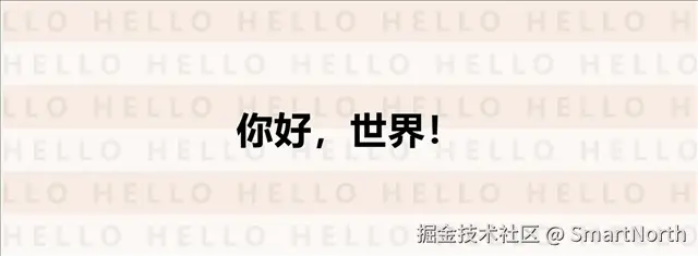
- 初始状态底部有浅色水印,且水印奇数行和偶数行有错位
- 初始状态中间文字为黑色的汉字
- 鼠标移入后,会在以鼠标为中心形成一个黑色圆形,黑色圆中有第二种背景水印,且水印依旧奇数行和偶数行有错位
- 鼠标移动到中间汉字部分,会有白色英文显示
- 鼠标迅速移动时,会根据鼠标移动轨迹有一个拉伸椭圆跟随,然后恢复成圆形的动画效果
现在基于这个交互的拆解,逐步来复刻交互效果
2. 组件结构与DOM设计
2.1 模板结构
采用「静态底层+动态上层」的双层视觉结构,通过CSS绝对定位实现图层叠加,既保证初始状态的视觉完整性,又能让交互效果精准作用于上层,不干扰底层基础展示。两层分工明确,具体如下:
| 图层 | 类名 | 内容 | 功能 |
|---|---|---|---|
| 底层 | .z-1 | 中文标题 "你好,世界!" 和灰色 "HELLO" 文字矩阵 | 静态背景展示 |
| 上层 | .z-2 | 英文标题 "Hello , World!" 和白色 "HELLO" 文字矩阵 | 鼠标交互时的动态效果层 |
2.2 核心 DOM 结构
<div class="container" @mouseenter="onMouseEnter" @mouseleave="onMouseLeave" @mousemove="onMouseMove">

  <!-- 底层内容 -->

  <div class="z-1">

    <div class="line" v-for="line in 13">

      <span class="line-item" v-for="item in 13">HELLO</span>

    </div>

  </div>

  <h1 class="title-1">你好,世界!</h1>


  <!-- 上层交互内容 -->

  <div class="z-2" :style="{ 'clip-path': circleClipPath }">

    <div class="hidden-div">

      <div class="line" v-for="line in 13">

        <span class="line-item" v-for="item in 13">HELLO</span>

      </div>

    </div>

    <h1 class="title-2">Hello , World!</h1>

  </div>

</div>
关键说明:hidden-div用于包裹上层文字矩阵,配合.z-2的定位规则,确保遮罩效果精准覆盖;两层文字矩阵尺寸一致,保证视觉对齐,增强透视沉浸感。
3. 技术实现
3.1 核心功能模块
3.1.1 轨迹点系统
轨迹点系统是实现平滑鼠标跟随效果的核心,通过维护6个轨迹点的位置信息,创建出具有弹性延迟的跟随动画。
// 轨迹点系统
const trailSystem = ref({
targetX: 0,
targetY: 0,
trailPoints: Array(6).fill(null).map(() => ({ x: 0, y: 0 })),
animationId: 0,
isInside: false

});
设计思路:6个轨迹点是兼顾流畅度与性能的平衡值——点太少则拖尾效果不明显,点太多则增加计算开销,配合递减阻尼系数,实现“头快尾慢”的自然跟随。
3.1.2 动态 Clip-Path 计算
通过计算鼠标位置和轨迹点的关系,动态生成 clip-path CSS 属性值,实现跟随鼠标的圆形/椭圆形遮罩效果。
// 计算clip-path值
const circleClipPath = computed(() => {
if (!showCircle.value) {
return 'circle(0px at -300px -300px)'; // 完全隐藏状态

  }

// 复制轨迹系统数据进行计算
const system = JSON.parse(JSON.stringify(trailSystem.value));

// 更新轨迹点
for (let t = 0; t < 6; t++) {
const prevX = t === 0 ? system.targetX : system.trailPoints[t - 1].x;
const prevY = t === 0 ? system.targetY : system.trailPoints[t - 1].y;
const damping = 0.7 - 0.04 * t; // 阻尼系数,后面的点移动更慢

const deltaX = prevX - system.trailPoints[t].x;
const deltaY = prevY - system.trailPoints[t].y;

// 平滑插值

    system.trailPoints[t].x += deltaX * damping;

    system.trailPoints[t].y += deltaY * damping;

  }

// 获取第一个点(头部)和最后一个点(尾部)
const head = system.trailPoints[0];
const tail = system.trailPoints[5];

const diffX = head.x - tail.x;
const diffY = head.y - tail.y;
const distance = Math.sqrt(diffX * diffX + diffY * diffY);

let clipPathValue = '';

if (distance < 10) { // 如果距离很近,显示圆形

    clipPathValue = `circle(200px at ${head.x}px ${head.y}px)`;

  } else {
// 创建椭圆形的polygon,连接头尾两点
const angle = Math.atan2(diffY, diffX); // 连接角度
const points = [];

// 从头部开始,画半个椭圆
for (let i = 0; i <= 30; i++) {
const theta = angle - Math.PI / 2 + Math.PI * i / 30;
const x = head.x + 200 * Math.cos(theta);
const y = head.y + 200 * Math.sin(theta);

      points.push(`${x}px ${y}px`);

    }

// 从尾部开始,画另半个椭圆
for (let i = 0; i <= 30; i++) {
const theta = angle + Math.PI / 2 + Math.PI * i / 30;
const x = tail.x + 200 * Math.cos(theta);
const y = tail.y + 200 * Math.sin(theta);

      points.push(`${x}px ${y}px`);

    }


    clipPathValue = `polygon(${points.join(', ')})`;

  }

return clipPathValue;

});
3.1.3 鼠标事件处理
实现了完整的鼠标交互逻辑,包括鼠标进入、离开和移动时的状态管理和动画控制。
| 事件 | 处理函数 | 功能 |
|---|---|---|
| mouseenter | onMouseEnter | 激活交互效果,初始化轨迹点 |
| mouseleave | onMouseLeave | 停用交互效果,重置轨迹点 |
| mousemove | onMouseMove | 更新目标点位置,驱动动画 |
4. 技术亮点
4.1 轨迹点系统算法
核心原理:使用6个轨迹点,每个点跟随前一个点移动,并应用不同的阻尼系数,实现平滑的拖尾效果。
技术优势:
- 实现了自然的物理运动效果,比简单的线性跟随更具视觉吸引力
- 通过阻尼系数的递减,创建出层次感和深度感
- 算法复杂度低,性能消耗小,适合实时交互场景
4.2 动态 Clip-Path 技术
核心原理:利用CSS clip-path属性的动态特性,结合轨迹点位置计算,实时生成不规则遮罩,替代Canvas/SVG的图形绘制方案,用更轻量化的方式实现复杂视觉效果。
技术优势:
- 无依赖轻量化:无需引入任何图形库,纯CSS+JS即可实现,减少项目依赖体积,降低集成成本
- 平滑过渡无卡顿:通过数值插值计算,实现圆形与椭圆形遮罩的无缝切换,无帧断裂感,视觉连贯性强
- 渲染性能优化:配合
will-change: clip-path提示浏览器,提前分配渲染资源,减少重排重绘,提升动画流畅度
5. 性能优化
- 渲染性能:
- 使用
will-change: clip-path提示浏览器优化渲染 - 合理使用 Vue 的响应式系统,避免不必要的重计算
- 事件处理:
- 仅在鼠标在容器内时更新目标点位置,减少计算量
- 鼠标离开时停止动画,释放资源
- 动画性能:
- 使用
requestAnimationFrame实现流畅的动画效果 - 鼠标离开时取消动画帧请求,避免内存泄漏
6. 总结与扩展
本次复刻的小米MiMo透视动画,核心价值在于“用简单技术组合实现高级视觉效果”——无需复杂图形库,仅依托Vue3响应式能力与CSS clip-path属性,就能打造出兼具质感与性能的交互组件。其核心亮点可概括为三点:
- 交互创新:轨迹点系统与动态clip-path结合,打破传统静态标题的交互边界,带来自然流畅的鼠标跟随体验
- 视觉精致:双层文字矩阵的分层设计,配合遮罩形变,营造出兼具深度感与品牌性的视觉效果
- 性能可控:轻量化技术方案+多维度优化策略,在保证视觉效果的同时,兼顾页面性能与可维护性
扩展方向
该组件的实现思路可灵活迁移至其他场景:
- 弹窗过渡动画:将clip-path遮罩用于弹窗进入/退出效果,实现不规则形状的过渡动画。
- 滚动动效:结合滚动事件替换鼠标事件,实现页面滚动时的元素透视跟随效果。
- 移动端适配:增加触摸事件支持,将鼠标交互替换为触摸滑动,适配移动端场景。
完整代码
<template>
<div class="hero-container" @mouseenter="onMouseEnter" @mouseleave="onMouseLeave" @mousemove="onMouseMove">
<div class="z-1">
<div class="line" v-for="line in 13">
<span class="line-item" v-for="item in 13">HELLO</span>
</div>
</div>
<h1 class="title-1">你好,世界</h1>

<!-- 第二个div,鼠标移入后需要显示的内容,通过clip-path:circle(0px at -300px -300px)达到隐藏效果 -->
<div class="z-2" :style="{ 'clip-path': circleClipPath }">
<div class="hidden-div">
<div class="line" v-for="line in 13">
<span class="line-item" v-for="item in 13">HELLO</span>
</div>
</div>
<h1 class="title-2">HELLO , World</h1>
</div>
</div>
</template>

<script setup>
import { ref, computed, onMounted, onUnmounted } from 'vue'

const showCircle = ref(false)
const containerRef = ref(null)

const trailSystem = ref({
targetX: 0,
targetY: 0,
trailPoints: Array(6)

    .fill(null)

    .map(() => ({ x: 0, y: 0 })),
animationId: 0,
isInside: false,

})

const circleClipPath = computed(() => {
if (!showCircle.value) {
return 'circle(0px at -300px -300px)'

  }

// 复制轨迹系统数据进行计算
const system = JSON.parse(JSON.stringify(trailSystem.value))

// 更新轨迹点
for (let t = 0; t < 6; t++) {
const prevX = t === 0 ? system.targetX : system.trailPoints[t - 1].x
const prevY = t === 0 ? system.targetY : system.trailPoints[t - 1].y
const damping = 0.7 - 0.04 * t // 阻尼系数,后面的点移动更慢

const deltaX = prevX - system.trailPoints[t].x
const deltaY = prevY - system.trailPoints[t].y

// 平滑插值

    system.trailPoints[t].x += deltaX * damping

    system.trailPoints[t].y += deltaY * damping

  }

// 获取第一个点(头部)和最后一个点(尾部)
const head = system.trailPoints[0]
const tail = system.trailPoints[5]

const diffX = head.x - tail.x
const diffY = head.y - tail.y
const distance = Math.sqrt(diffX * diffX + diffY * diffY)

let clipPathValue = ''

if (distance < 10) {
// 如果距离很近,显示圆形

    clipPathValue = `circle(200px at ${head.x}px ${head.y}px)`

  } else {
// 创建椭圆形的polygon,连接头尾两点
const angle = Math.atan2(diffY, diffX) // 连接角度
const points = []

// 从头部开始,画半个椭圆
for (let i = 0; i <= 30; i++) {
const theta = angle - Math.PI / 2 + (Math.PI * i) / 30
const x = head.x + 200 * Math.cos(theta)
const y = head.y + 200 * Math.sin(theta)

      points.push(`${x}px ${y}px`)

    }

// 从尾部开始,画另半个椭圆
for (let i = 0; i <= 30; i++) {
const theta = angle + Math.PI / 2 + (Math.PI * i) / 30
const x = tail.x + 200 * Math.cos(theta)
const y = tail.y + 200 * Math.sin(theta)

      points.push(`${x}px ${y}px`)

    }


    clipPathValue = `polygon(${points.join(', ')})`

  }

return clipPathValue

})

// 动画循环函数
const animate = () => {
if (showCircle.value) {
// 更新轨迹点
for (let t = 0; t < 6; t++) {
const prevX = t === 0 ? trailSystem.value.targetX : trailSystem.value.trailPoints[t - 1].x
const prevY = t === 0 ? trailSystem.value.targetY : trailSystem.value.trailPoints[t - 1].y
const damping = 0.7 - 0.04 * t // 阻尼系数,后面的点移动更慢

const deltaX = prevX - trailSystem.value.trailPoints[t].x
const deltaY = prevY - trailSystem.value.trailPoints[t].y

// 平滑插值

      trailSystem.value.trailPoints[t].x += deltaX * damping

      trailSystem.value.trailPoints[t].y += deltaY * damping

    }

// 请求下一帧

    trailSystem.value.animationId = requestAnimationFrame(animate)

  }

}

const onMouseEnter = (event) => {
const container = event.currentTarget
const rect = container.getBoundingClientRect()
const x = event.clientX - rect.left
const y = event.clientY - rect.top


  showCircle.value = true

// 初始化目标位置和轨迹点

  trailSystem.value.targetX = x

  trailSystem.value.targetY = y

  trailSystem.value.isInside = true

// 初始化所有轨迹点到当前位置
for (let i = 0; i < 6; i++) {

    trailSystem.value.trailPoints[i] = { x, y }

  }

// 开始动画
if (!trailSystem.value.animationId) {

    trailSystem.value.animationId = requestAnimationFrame(animate)

  }

}

const onMouseLeave = (event) => {
const container = event.currentTarget
const rect = container.getBoundingClientRect()
const x = event.clientX - rect.left
const y = event.clientY - rect.top


  showCircle.value = false

  trailSystem.value.isInside = false

// 将目标点移出容器边界,使轨迹点逐渐拉回
let targetX = x
let targetY = y

if (x <= 0) targetX = -400
else if (x >= rect.width) targetX = rect.width + 400

if (y <= 0) targetY = -400
else if (y >= rect.height) targetY = rect.height + 400


  trailSystem.value.targetX = targetX

  trailSystem.value.targetY = targetY

// 停止动画
if (trailSystem.value.animationId) {
cancelAnimationFrame(trailSystem.value.animationId)

    trailSystem.value.animationId = 0

  }

}

const onMouseMove = (event) => {
if (showCircle.value) {
const container = event.currentTarget
const rect = container.getBoundingClientRect()
const x = event.clientX - rect.left
const y = event.clientY - rect.top


    trailSystem.value.targetX = x

    trailSystem.value.targetY = y

  }

}
</script>

<style scoped>
.hero-container {
cursor: crosshair;
background: #faf7f5;
border-bottom: 1px solid #000;
justify-content: center;
align-items: center;
width: 100%;
height: 500px;
display: flex;
position: relative;
overflow: hidden;

}

.z-1 {
pointer-events: auto;

  -webkit-user-select: none;

  user-select: none;
flex-direction: column;
justify-content: flex-start;
width: 100%;
height: 100%;
display: flex;
position: absolute;
top: 0;
left: 0;
overflow: hidden;

}

.z-1 .line {
display: flex;
align-items: center;
white-space: nowrap;
color: #0000000d;
letter-spacing: 0.3em;
flex-wrap: nowrap;
font-size: 52px;
font-weight: 700;
line-height: 1.6;
display: flex;

}

.z-1 .line-item {
cursor: default;
flex-shrink: 0;
margin-right: 0.6em;
transition:

    color 0.3s,

    text-shadow 0.3s;
font-family: inherit !important;

}

.z-1 .line:nth-child(odd) {
margin-left: -2em;
background-color: rgb(245, 235, 228);

}

.title-1 {
z-index: 1;
color: #000;
letter-spacing: 0.02em;
text-align: center;
margin: 0;
font-size: 72px;
font-weight: 700;

}

.z-2 {
pointer-events: none;
z-index: 10;
will-change: clip-path;
background: #000;
justify-content: center;
align-items: center;
width: 100%;
height: 100%;
display: flex;
position: absolute;
top: 0;
left: 0;

}

.z-2 .hidden-div {
pointer-events: none;

  -webkit-user-select: none;

  user-select: none;
flex-direction: column;
justify-content: flex-start;
width: 100%;
height: 100%;
display: flex;
position: absolute;
top: 0;
left: 0;
overflow: hidden;

}

.z-2 .hidden-div .line {
white-space: nowrap;
color: #ffffff1f;
letter-spacing: 0.3em;
flex-wrap: nowrap;
font-size: 32px;
font-weight: 700;
line-height: 1.6;
display: flex;

}

.z-2 .hidden-div .line:nth-child(odd) {
margin-left: -0.5em;

}

.title-2 {
font-size: 72px;
color: #fff;
letter-spacing: 0.02em;
text-align: center;
white-space: nowrap;
margin: 0;
font-size: 72px;
font-weight: 700;

}
</style>
小米的前端一直很牛,非常有创意,我也通过F12学习源码体会到了新的思路,希望大家也多多关注小米和小米的技术~
来源:juejin.cn/post/7598005428258340927
